

James Macon, M.Ed., BCBA with contributions from Mike Sowa, M.S., BCBA
Rick Kubina ruined applied behavior analysis for me. That’s what I tell all my colleagues who will listen. Put another way, Dr. Rick Kubina, Professor at The Pennsylvania State University and founder of Chartylitics, completely changed the way I conceptualize visual analysis and charting behavior change.
There was a time when blissfully unaware of the fallacies of the non-standard linear chart (aka the typical, single-subject design chart, the ones most of us behavior analysts use every day). That all changed during a Standard Celeration Chart workshop with Rick and his team, who showed us the impact the chart can have.
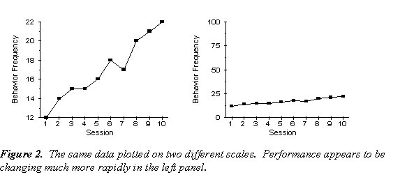
To illustrate my grievance, take a look at the graphs directly below. Assuming we want the graphs to show an increase over time, which one looks better? At first glance, most would say the graph on the left. In reality, it’s the same data set, but plotted on 2 different scales.
From <https://psych.athabascau.ca/open/lindsley/concept.php>
Simply put, using a non-standard chart (like the graphs above) can seriously misrepresent behavior change and lead to poor clinical decision making if we’re relying on visual analysis (a cornerstone of our field).
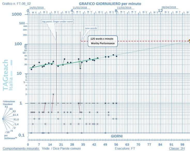
The alternative to the non-standard chart is to use a Standard Celeration Chart (SCC). First developed by Ogden Lindsley in 1965, the chart utilizes frequency and rate to describe behavior change, and rate and growth of learning across time (i.e., celeration).
I had been familiar with Standard Celeration Charts, but at the time had never received any formal training on how to use them. Colleagues of mine who did were always very quick to point out that 3rd grade children and clients with autism were successfully being taught how to use them, and that if I thought I was smarter then a 3rd grader, then surely I could figure it out. That line of reasoning probably persuaded me not to try to learn them, for fear of being outdone by a 3rd grader.
After being trained on how to read and use the chart, I’m a believer. For us behavior folk, we regard ourselves as scientist-practitioners. We use behavioral science to improve the human condition and make socially significant behavior change possible. Having a scientific measurement tool like the Standard Celeration Chart allows for precision in a way that is just not possible using non-standard charts.
Here are a few reasons to consider why Standard Celeration Charts are the way to go, from my friend Mike Sowa, BCBA.
1. Results are not misleading
The SCC is standard and comes pre-made. You simply drop a dot onto the chart and see the results. A problem with Excel made graphs— or any computer generated graphs— are the graph tends to be zoomed in to only that data range. When we add more data, the software can automatically change the axis. This can impact the accuracy of the graph and doesn’t allow us to see bigger picture behavior changes.
2. Accurate predictions of future behavior
The SCC is semi-logarithmic; the vertical axis grows by a rate of times 10. Each major number on the y-axis is 10 times larger than the last major number (i.e., 1, 10, 100, 1000, etc.). This allows us to see rate of learning over time, and can allow us to make better predictions.
As an example, say we have a client just learning to label things (tacting). If during the first week of tact training, he learns 10 words, we would be thrilled! That would be a 10x fold improvement over his baseline. If after 5 weeks of learning, when our client can tact 100 items, would we be as thrilled by a another subsequent 10 word improvement? Probably Not. We would be pleased, but not celebrating like we were early on. The rate in behavior change would be significantly less than early on (growth rate of 1.1, compared to 10, respectively). Using a SCC would show us that rate quickly and easily, along with the current frequency, and would allow us to see the future trajectory of the data path.
| Week | Start | End | growth |
| Week 1 | 0 | 10 | 10x |
| Week 5 | 100 | 110 | 1.1x |
3. The SCC is easy to read
After becoming familiar with the SCC, you simply need to look at where the dot lies and see how the behaviors are progressing. The logarithmic y-axis allows for all similar growth rates to be displayed in the same manner.
For example, a learner who knows 10 words on Monday and 20 words the subsequent Monday will show the same learning line as someone who knows 100 words on Monday and 200 words the following Monday. In both examples the learning rate was the same; the learner doubled what they knew over one week.
The learning line of the data can be calculated by how much growth occurred over a week’s time and displayed as a simple number. When talking with other charters a learner’s growth rate can be easily communicated by these numbers.
There are many more reasons to use the SCC. It’s more than a blue chart with a lot of lines- it’s a power visual display and measurement tool that allows for better programing and data analysis.
This post was really an eye opener!
I have a few questions regarding the BCBA credential.
I’ve heard many people say, oh why not just take the under-grad, graduate coursework to become a BCaBA and BCBA respectively. Here’s my question. The number of hours that the certificates give you as a whole are less than the coursework requirements. Probably not a huge gap, but yes there is a difference in the number of hours! How does one cater to that? I probably sound naive at this point of time, but I am new to the ABA world, so wanted guidance from the big names like you! as you are THE BCBA! which is obviously a dream for me right now 🙂
Hi Maheen! We finally have our comment section working properly 🙂 You are correct, there is a difference in total hours between the BCaBA and BCBA credentials. The gap is not huge, but it’s significant enough to require BCaBA’s to work under the supervision of a BCBA, and have ongoing monthly supervision requirements (on top of continuing education). The BCaBA credential is still a great option, it just depends on what you want to do once your finished!